Mixing Prints Without Clashing: Easy Outfit Rules
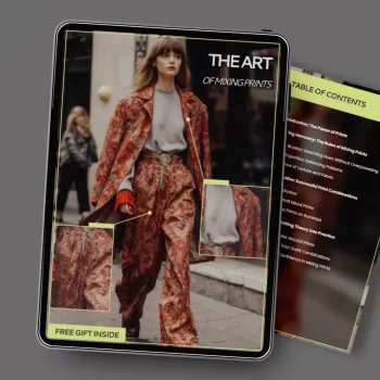
The Art of Mixing Prints: A Practical Style Guide for Confident Pattern Pairing
Mixing prints can look polished and intentional when a few simple rules guide scale, color, and spacing. With the right “anchor” piece and a supporting pattern that plays nicely, stripes, florals, checks, and even animal prints can coexist without feeling chaotic. The goal isn’t to match perfectly—it’s to create a clear visual hierarchy so the outfit reads as styled, not accidental. For more guidance, see College of Art | Washington University Bulletin.
What Makes Mixed Prints Look Intentional
The best mixed-print outfits have a plan you can feel, even if you can’t immediately explain it. A clear anchor print sets the direction (usually the boldest or most colorful piece). From there, contrast in scale prevents visual noise—pair one large-scale motif with a smaller, tighter pattern so the eye has an easy path to follow. For further reading, see [PDF] THEATRICAL ROMANTIC STYLE GUIDE – lin2.onecollective.org.
A shared color story is the glue: if two prints repeat even one tone, they start to “belong” together. Finally, add breathing space with solids (denim, knits, a blazer, tailored trousers) so prints look curated rather than stacked on top of each other.
Start With One Anchor Print, Then Add One Supporting Pattern
Choose the anchor print first: think a floral skirt, leopard coat, or a bold striped shirt. Then select one supporting print that repeats at least one color from the anchor. To keep the mix feeling elevated, the supporting print should be simpler—either fewer colors, a cleaner geometry, or a softer contrast.
If you’re building confidence, keep the first outfit to two prints. Two is where most people look instantly “put together,” because the relationship is easy to read: one statement, one sidekick.
Easy Pairings That Rarely Clash
| Anchor print | Supporting print | Why it works | Best neutral spacer |
|---|---|---|---|
| Bold floral | Thin stripe | Organic + geometric contrast; stripes act like a neutral | Denim jacket |
| Leopard | Solid-color check | Both feel classic; one reads as texture, one as structure | Black trousers |
| Polka dots | Breton stripe | Two timeless motifs; clean lines keep it tidy | White blazer |
| Plaid | Micro-floral | Strong framework + delicate detail | Camel coat |
| Graphic print | Tone-on-tone stripe | Keeps the statement while reducing competing colors | Cream knit |
Use the Scale Rule: One Big, One Small, One Solid
Scale is the quiet rule that makes print mixing look effortless. If both prints are large, the look can feel busy; if both prints are tiny, the outfit can look fussy or overly detailed. A reliable formula is: large print (statement piece) + small print (supporting) + solid (grounding).
When clothing prints feel like too much, let accessories do the “small print” job: a striped scarf, a dotted belt, or a compact patterned bag can introduce contrast without taking over.
Build a Color Plan Without Overthinking It
Color is the shortcut to cohesion. Pick 2–3 core colors and keep most pieces inside that palette. Then repeat one color at least twice (top + shoe, skirt + bag) so the outfit feels connected from head to toe.
Neutrals are the best connectors: black, white, cream, navy, camel, olive, and denim are especially forgiving. When you’re unsure, make one print monochrome—like a black-and-white stripe or a neutral check—so the other print can be the star. For extra help choosing harmonizing tones (especially when you’re mixing warm and cool shades), Pantone’s resources can be a useful reference point: Pantone Color Systems and Guidance.
Placement Tricks That Make Prints Feel Balanced
Where you place a print matters as much as which print you choose. If a pattern feels loud near your face, move the statement downward: a bold skirt with a calmer top often feels instantly more wearable. Solid separates can also “frame” prints—try a solid belt at the waist, or a structured blazer over a printed dress to create clean boundaries.
If mixing prints across top and bottom feels intimidating, start smaller: pair a printed accessory with a printed blouse and keep everything else solid. Also match the vibe and texture level—an elegant silk scarf print can fight with an athletic graphic tee unless something (like a tailored jacket) bridges the mood. For inspiration on how pattern, textiles, and cultural references have been combined across eras, the Met’s fashion and textile history is a rich resource: The Metropolitan Museum of Art – Heilbrunn Timeline of Art History.
Three Go-To Outfit Formulas for Everyday Confidence
Work-ready: A subtle stripe top + tailored plaid trousers + a solid blazer + sleek loafers. Keep the colors close (navy/cream/black, or camel/white/olive) so the patterns feel professional and calm.
Common Print-Mixing Mistakes (and Quick Fixes)
Shop the Guides & Everyday Staples
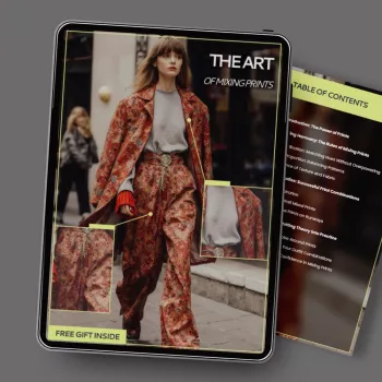
If you want a repeatable system you can reference anytime you’re getting dressed, explore The Art of Mixing Prints – A Style Guide on How to Mix Prints Without Clashing | Fashion Confidence Digital Download. For a practical reminder that pattern pairing isn’t only for clothing, a coordinated table setting can be a low-pressure way to practice combining motifs (think stripes with florals in napkins and runners): Porcelain Dinnerware Set.
FAQ
What prints are easiest to mix for beginners?
Start with stripes, small polka dots, or subtle checks as the supporting print. Pair one of those with a bolder anchor print and make sure they share at least one color so the mix feels cohesive.
How many prints can be worn at once without looking messy?
Two prints is the easiest to balance. Three can work when one is very subtle (like a thin stripe) and you include a solid piece to create breathing room.
Do prints have to match colors exactly to work together?
Exact matches aren’t required. Repeating one similar tone—like navy with denim blues or warm red with burgundy—is usually enough, especially when neutrals help connect the outfit.











Leave a comment