Pastel Playbook: Cozy-Chic Pastel Outfits Made Easy

Pastel Playbook: A Cozy-Chic Guide to Styling Soft Colors With Confidence
Soft pastels can look polished and modern when the palette is intentional, the textures feel cozy, and the outfits have a clear silhouette. The goal isn’t to dress like an Easter egg—it’s to use gentle color the way you’d use great lighting: flattering, calming, and put-together. Below is a practical approach to building a wearable pastel capsule, mixing tones without looking washed out, and relying on repeatable outfit formulas that work for real life.
What makes pastels feel cozy-chic (not costume-y)
Pastels read “cozy-chic” when they’re balanced with structure and grounded contrast. A few simple styling moves keep soft colors looking current instead of overly sweet.
- Balance sweetness with structure: Pair soft hues with tailored shapes like straight-leg trousers, crisp button-downs, or a structured knit. A clean silhouette does a lot of the heavy lifting.
- Use contrast on purpose: Add one grounding element per outfit—dark denim, camel, chocolate, charcoal, navy, or crisp white—to keep the look from “floating.”
- Lean into tactile fabrics: Brushed knits, ribbed cotton, bouclé, soft denim, satin, and lightweight wool blends add depth and warmth. (If you’re curious about how different fabrics behave, this overview of textile fibers and fabric basics is a helpful primer.)
- Keep the vibe modern with clean lines: Skip too many ruffles, tiny prints, or ultra-matching sets unless the silhouette is minimal and sleek.
A simple pastel palette that mixes easily
The easiest way to wear pastels confidently is to limit the rainbow. Choose a tight palette you can repeat across tops, knits, and accessories, then add neutrals that “hold” the outfit together.
- Start with 2–3 core pastels: Powder blue, blush, and lavender is a classic trio, but mint, butter yellow, and peach also mix beautifully.
- Add 1 light neutral and 1 deep neutral: Cream/ivory/soft white brightens; navy/charcoal/espresso (or dark denim) grounds.
- Keep new shades as accents: Until your capsule feels complete, test “extra” pastels as scarves, bags, nail color, or hair accessories.
- Prefer dusty pastels if brights feel loud: Muted, gray-leaning versions read more sophisticated and are often easier to wear.
Pastel palette builder (pick one from each column)
| Core Pastels | Light Neutral | Deep Neutral | Optional Metallic |
|---|---|---|---|
| Powder blue / Blush / Lavender | Cream / Ivory / Soft white | Navy / Charcoal / Espresso | Silver / Champagne / Pearl |
| Mint / Butter yellow / Peach | Oat / Light gray / Sand | Dark denim / Black (minimal) / Forest | Soft gold / Rose gold / Gunmetal |
For a helpful reference on color systems and why certain tones feel more “muted” than others, the Pantone color systems overview is a useful rabbit hole to explore.
Outfit formulas that work year-round
Instead of reinventing the wheel each morning, rely on a few repeatable formulas. Swap fabrics and layers by season, but keep the underlying structure the same.
- Knit + denim + clean sneaker: A pastel sweater with medium-wash jeans and a white sneaker. Add a deep-neutral belt or bag to ground it.
- Monochrome with a twist: Match a pastel top and bottom (think blush knit + blush trouser), then add contrast with deep-neutral shoes or outerwear.
- Soft-on-soft layering: A pastel tee under an open cardigan in a neighboring pastel; anchor with cream trousers for an airy but intentional look.
- Polished minimal: A pastel blouse with tailored trousers, pointed flats, and a structured tote reads office-ready without feeling loud.
- Cozy dress uniform: A pastel sweatshirt + matching joggers, elevated with a long coat and sleek sneakers.
How to avoid looking washed out in soft colors
If pastels sometimes make you feel “faded,” it’s usually a contrast and placement issue—not a rule that you can’t wear soft color.
- Move pastels away from the face: Choose pastel bottoms, or add a cream/white collar layer (a crisp shirt or tee) to frame your face.
- Increase neckline contrast: A slightly deeper pastel—periwinkle instead of baby blue, mauve instead of pale pink—often looks more defining.
- Use texture and shine: Satin, ribbing, and bouclé create dimension so the outfit doesn’t read flat.
- Add definition with accessories: Jewelry near the face, a defined lip, or even stronger brow definition can balance softness.
Color perception is also tied to mood and context; the APA’s overview on the psychology of color is a smart reminder that “flattering” often includes how a color makes you feel.
A practical capsule checklist for a pastel wardrobe
Pastel Playbook digital download: what it is and how to use it
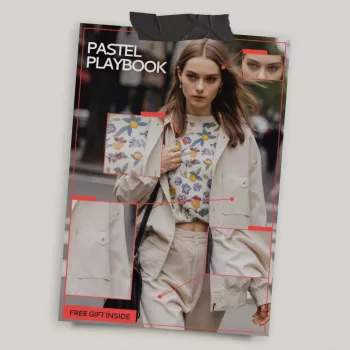
If you want a faster way to turn “pretty colors” into repeatable outfits, Pastel Playbook – Digital Download Pastel Outfit Styling Guide, Cozy Chic Wardrobe eBook, Soft Color Capsule Checklist is designed to make the process simple: pick a palette, follow outfit formulas, and build a small capsule that mixes easily.
Gifting and printing tips for a smooth download experience
For a cozy-chic moment beyond the closet, a soft-toned table setting can echo the same palette at home. If you enjoy that aesthetic, the Porcelain Dinnerware Set is a simple way to bring that clean, light-neutral look into everyday routines.
FAQ
What’s included in the Pastel Playbook digital download?
It includes a downloadable pastel outfit styling guide with a cozy-chic approach and a soft color capsule checklist. It’s built for planning outfits and creating a mix-and-match wardrobe with a consistent palette.
How do pastels work in a capsule wardrobe without feeling repetitive?
Use 2–3 core pastels across different textures, add a light neutral and a deep neutral for contrast, and rotate silhouettes and layers. Variety comes from shape and fabric, not constantly changing colors.
Which neutral colors pair best with pastel outfits?
Cream, ivory, and soft white brighten pastels, while navy, charcoal, espresso, and dark denim ground them. Black can work sparingly when you want sharper contrast and cleaner edges.








Leave a comment